Cross-Cultural Heuristic Evaluation
Planning & Method
The 8-week project involved cross-functional collaboration, starting with a kick-off meeting to establish goals and task ownership. My role included desk research for a pre-study on payment habits in target markets. The UX team, led by my supervisor, focused on a heuristic evaluation of Zimpler’s product and competitors in three assigned markets due to time constraints. While user interviews would have provided more insight, the chosen method proved fitting. We followed a modified agile workflow with weekly group meetings, additional sessions for UX designers and the project manager, and retrospectives for continuous improvement.
Research
Before conducting the heuristic evaluation, I immersed myself in previous market research and existing data through desk research. I scheduled sync sessions with relevant individuals at the company to address project-related queries. Finding these individuals was straightforward, given our ongoing cross-functional collaboration. After this preparatory phase, I delved into my own desk research on specific countries, focusing on payment methods, distribution across regions, and overall cultural insights. I utilized GlobalData, a valuable service accessible to Zimpler, to examine reports specific to Sweden, Denmark, and Germany. In the pre-study research, I unearthed significant insights that could shape Zimpler’s strategy. Understanding popular payment methods in each country was crucial, especially in evaluating the feasibility of introducing an A2A payment product. Design decisions and material for user interviews and usability tests were influenced by users’ comfort with existing payment methods and the availability of solutions for pain points. In essence, this information guided my approach to engaging users in these markets and informed strategic decisions for Zimpler’s payment solution.
Heuristic Evaluation
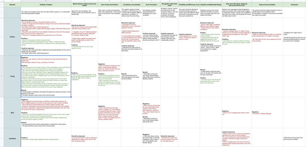
The team gathered data to identify competitors in the three markets. To evaluate usability, the UX lead and I opted for Norman’s 10 Usability Heuristics, creating a detailed Google sheet with columns for each heuristic and tabs for Zimpler, competitors, and banks in each country. Utilizing test phones provided by the company, I manually navigated through payment flows, deliberately introducing errors and testing various functions to generate diverse results for the evaluation. The findings, categorized as negative, positive, or neutral for each heuristic, were documented directly in the spreadsheet. Despite the cumbersome process of navigating through flows multiple times for each bank, competitor, and country, the end result was a thorough and comprehensive evaluation.
Design implementation
Building on the findings, I collaborated with the lead designer in the UX team to implement various design changes in the payment flow. The process began by reviewing and documenting potential changes, prioritizing those applicable across all payment flows, considering the undecided markets. After compiling a comprehensive list and gaining approval from the UX lead, I engaged front-end developers to assess the technical feasibility of each change. I created multiple design alternatives for each proposed modification based on their input. These alternatives were then reviewed and discussed with the design and UX lead. Following their feedback and approval, I translated the chosen alternatives into detailed Jira tickets, including information, images, and Figma links for the front-end team.
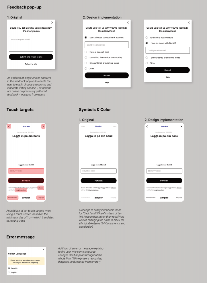
The design changes that were made based on the insights of the heuristic evaluation and competitor analysis were:
• Addition of touch targets for the mobile version of the product.
• Addition of specific feedback-options to choose from (these differed depending on which stage of the payment flow the user decided to exit). The options were based on some of the most popular feedback responses previously gathered by the data team.
• A variety of different text changes (copywriting) across the flow in order to provide cohesive (similar login instructions across all banks) and easy to understand terms.
• Additon of a legal text (Accepting terms of condition & providing links) available for the user when choosing to continue with the payment.
• Addition of specific error-messages that were previously generic or lacking.
• Change of button designs from text to symbols as well as having the same type of color for all clickable objects.


